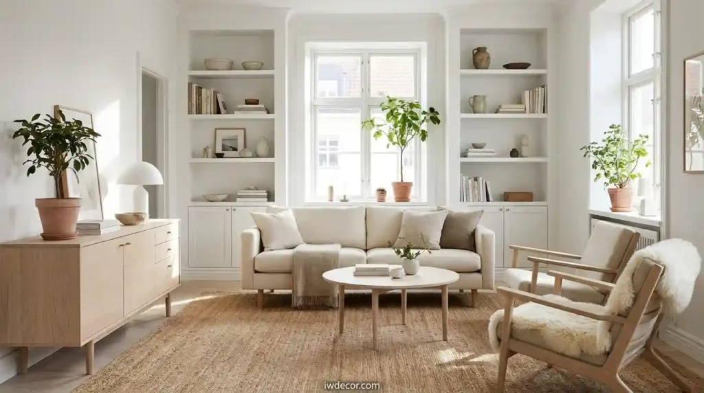
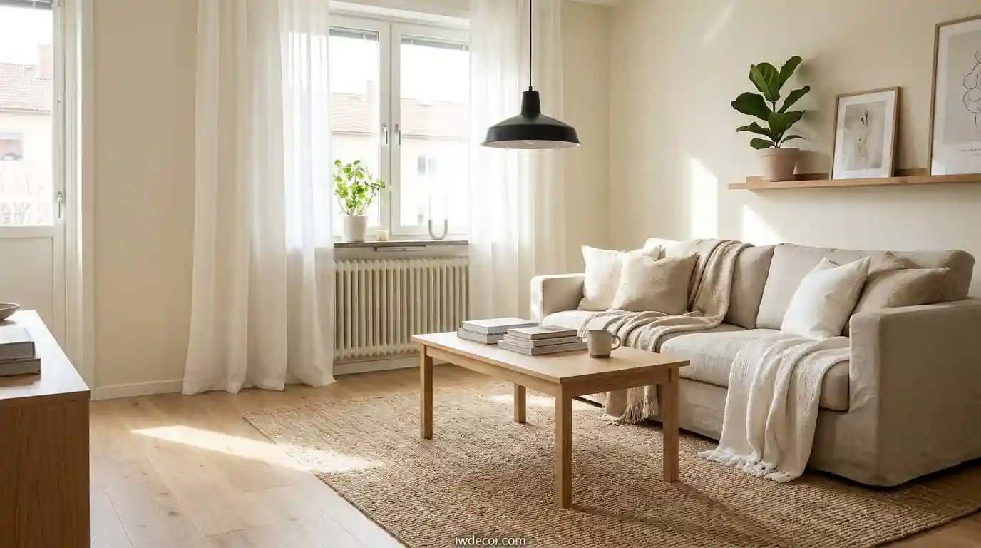
15 Best Scandinavian Interior Decor: What’s Trending in 2026?
Scandianvian interior decor has stopped being a trend and become something people actually want to live in. Unlike the sterile minimalism that felt cold five years ago, the current iteration blends light, warmth, and function in ways that make real sense for how we actually spend time at home. I’ve spent months testing these ideas across different climates and budgets, and the patterns are clear: Scandinavian design works because it solves real problems limited daylight, small spaces, decision fatigue from too many choices.
The question isn’t whether scandinavian interior decor fits your home anymore; it’s which specific elements belong in your space. Let me walk you through the methods that shift rooms from looking “fine” to feeling genuinely intentional.
The Core Elements of Scandinavian Interior Decor
1. Light Wall Colors: Skip Hospital White
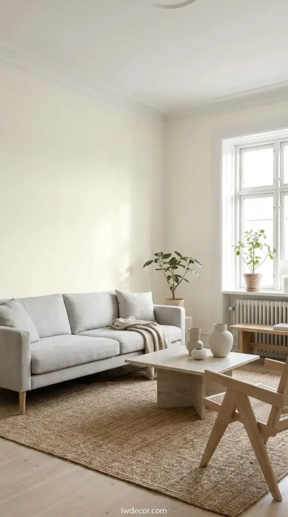
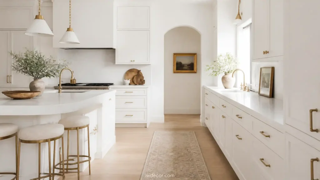
Scandinavian interior decor starts with walls that feel intentional, not like you ran out of paint options. Pure white reads clinical; what works is off-white with warmth baked in. Look for hues with subtle cream, grey, or barely-there yellow undertones. Benjamin Moore’s “Swiss Coffee” or “Accessible Beige” catch that balance bright enough to bounce light around in winter, warm enough to feel like a room, not a box.
My Take
I tested pure white walls in a north-facing room last winter, and it genuinely felt depressing by February. Switching to a warmer off-white was the single biggest mood shift. It’s not scientific, but it matters.
2. Natural Wood as Foundation
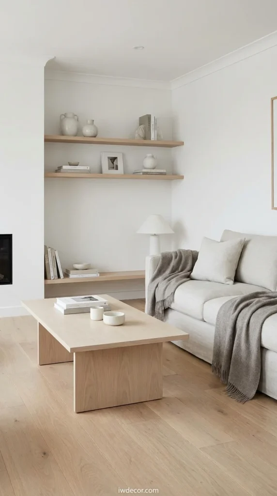
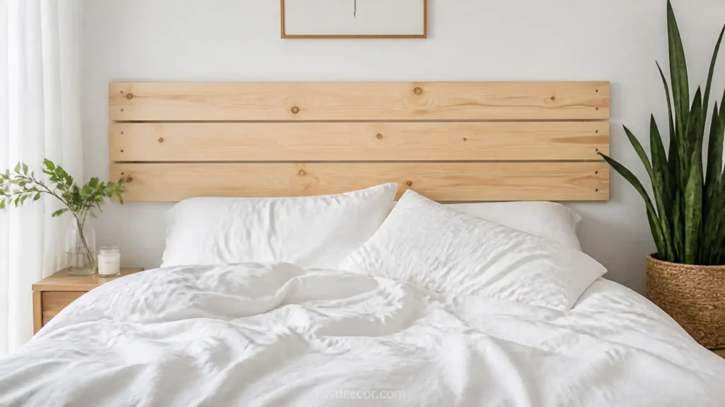
Wood in Scandinavian interior decor isn’t dark or carved; it’s honest. Light oak, pale birch, or limed finishes show the grain instead of hiding it. This works in floors, furniture, and shelving. Pair light wood with white for the traditional Scandinavian look, or with warm grey for something slightly more contemporary.
3. The 3-5-7 Rule for Scandinavian Rooms
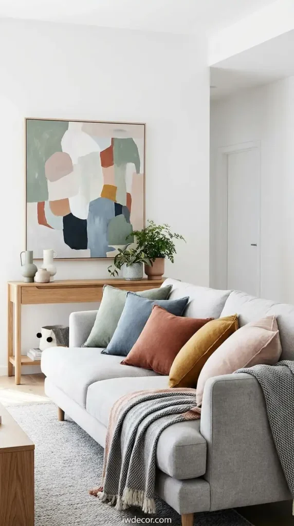
The 3-5-7 rule is simpler than it sounds: choose 3 main colors (your base palette), then 5 supporting accent shades, then 7 as your smallest pops. For scandinavian interior decor, that means 3 neutrals (white, grey, wood tone), 5 accent colors from your chosen range (maybe sage, dusty blue, terracotta), and 7 micro-accents through pillows, art, or plants.
4. Building a Neutral Color Palette That Isn’t Boring
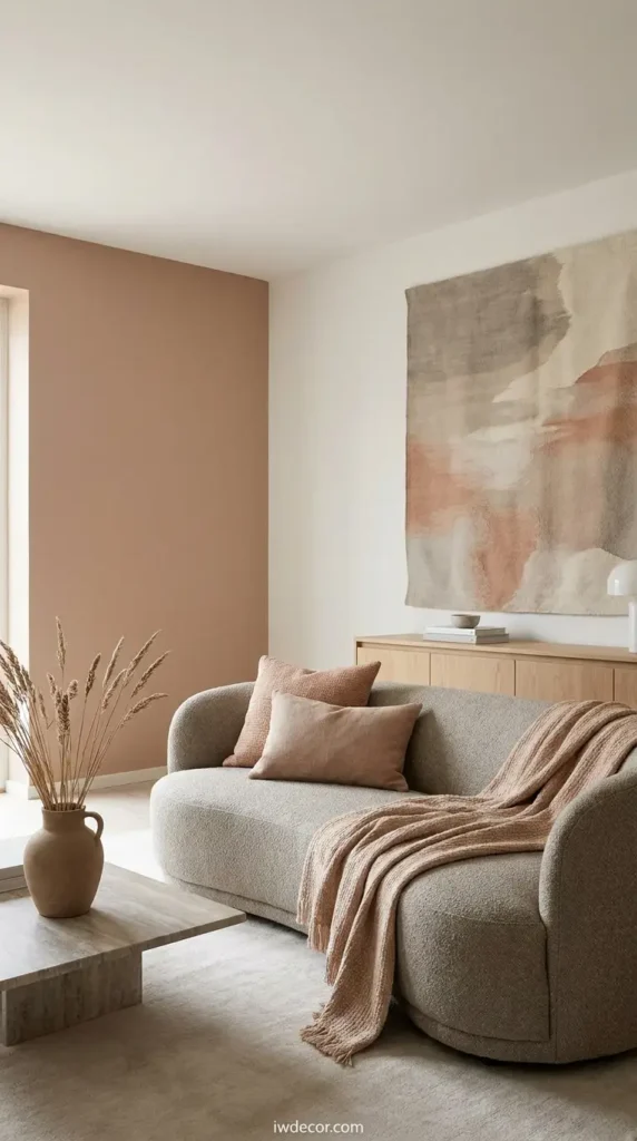
The colors replacing grey in 2026 for scandinavian interior decor are muted warmth: pale terracotta, soft clay, and greige (grey-beige hybrid). These sit between full color and pure neutrality, adding personality without chaos. Layer them through furniture upholstery, one accent wall, or large textiles.
5. Layered Textiles Over Hard Surfaces
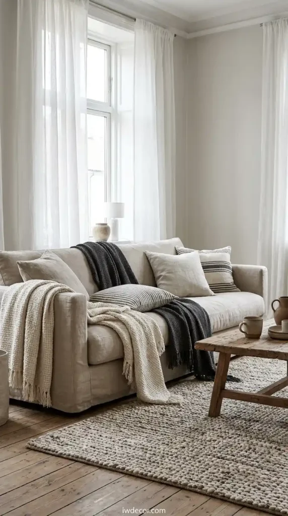
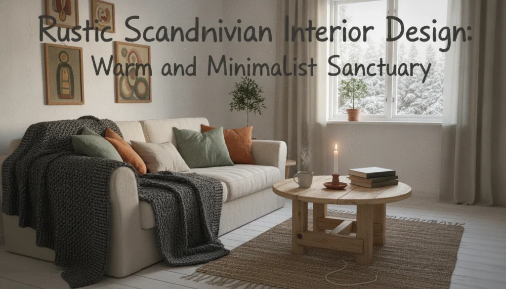
Scandinavian interior decor gets accused of being cold, but that’s because people skip textiles. A linen sofa, layered cotton throw blankets, a wool area rug, and linen curtains transform wood and white into somewhere you actually want to spend time. These materials breathe and age well; they’re not precious.
6. Strategic Lighting for Long Dark Months
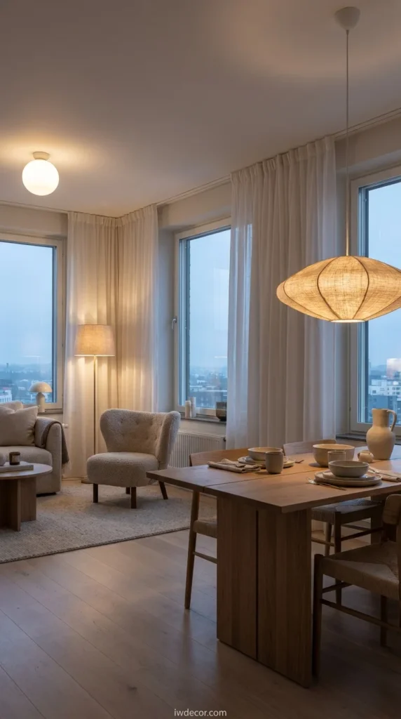
Windows matter most, so keep them bare or with sheer curtains. For evening, layer ambient lighting: ceiling fixtures for general light, pendant lights over a desk or dining table, and table lamps for corners. Avoid recessed overhead lights alone; they flatten Scandinavian interior decor’s whole aesthetic.
My Take
Good lighting is non-negotiable in Scandinavian interior decor. One room with five different light sources feels alive at 5 PM in December; the same room with only overhead lights feels like an airport.
7. Furniture Placement: The 70/20/10 Rule in Decorating
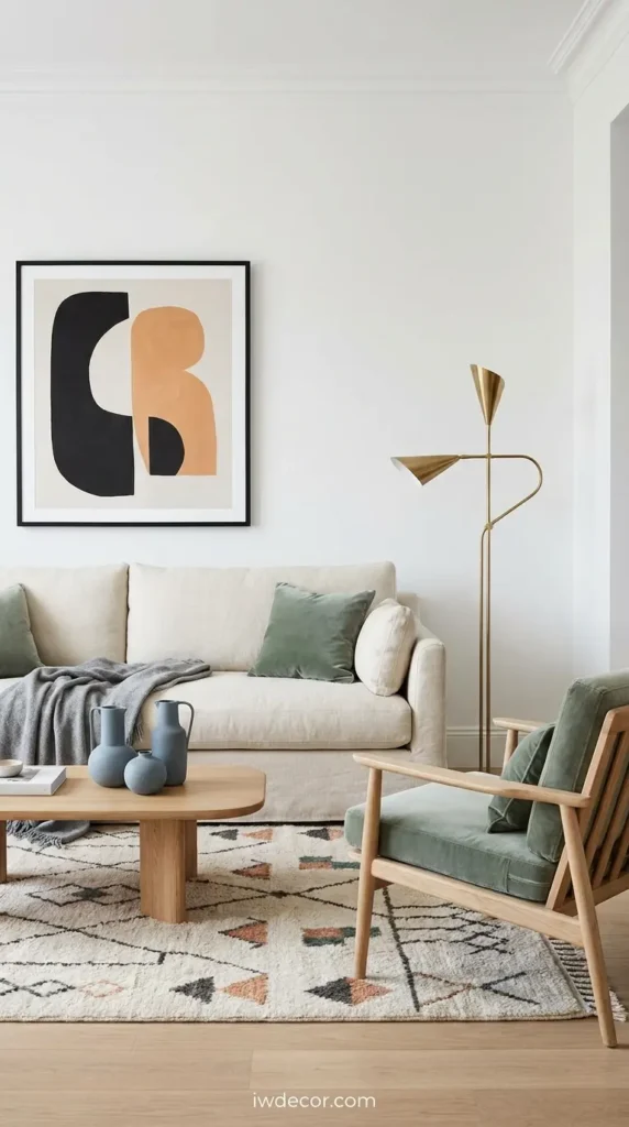
The 70/20/10 rule means 70% of your room should be neutral, 20% a secondary color, and 10% an accent. In scandinavian interior decor, that translates to 70% white and light wood, 20% your chosen palette (grey, sage, dusty blue), and 10% pops through art, pillows, or one sculptural piece.
8. Storage That Actually Hides Things
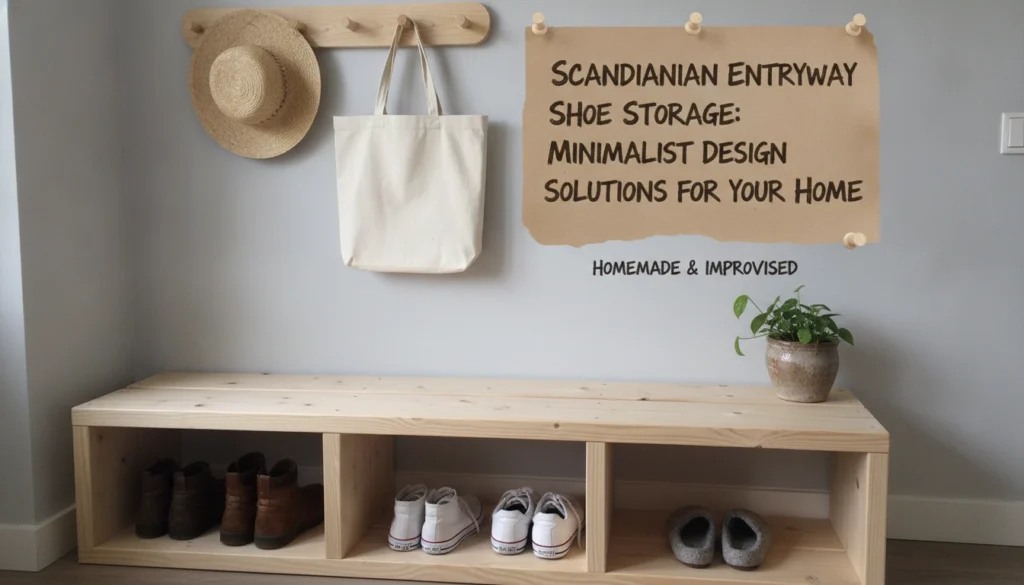
Open shelving in Scandinavian interior decor looks calm only if shelves are actually minimal. If you prefer closed storage, built-in cabinets or a curtained wardrobe keep visual noise at zero. The biggest mistake in placement of furniture and storage is making them visible they should anchor a room, not steal attention.
9. Plant-Forward Doesn’t Mean Jungle
Plants in scandinavian interior decor follow the same logic as everything else: intentional. One large plant in a corner, three medium plants spaced across a shelf, or a single trailing plant on a floating shelf. Not 17 varieties crammed into every surface. Pale ceramic or wood planters keep the aesthetic consistent.
10. Black Accents for Visual Weight
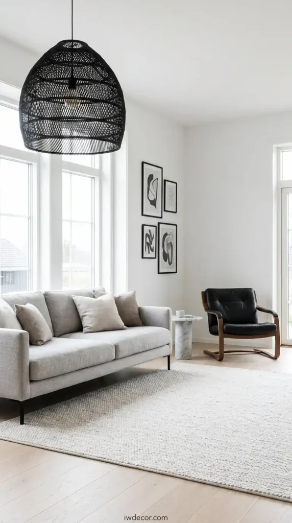
What makes scandinavian interior decor feel intentional instead of monotone is strategic black: a black pendant light, black picture frames, black furniture legs, or a single black accent chair. Black grounds the room and prevents it from floating into “pretty but boring” territory.
11. Hygge Layering Beyond Candles
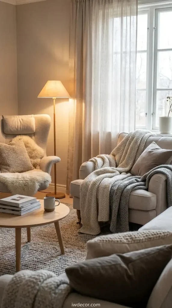
Hygge (that Danish coziness) in scandinavian interior decor goes beyond candlelight. It’s soft blankets folded on a chair, a low coffee table you can actually put your feet on, a reading corner with a warm lamp, and textiles you want to touch. It’s about the room inviting you to slow down.
12. Floor Materials That Ground a Room
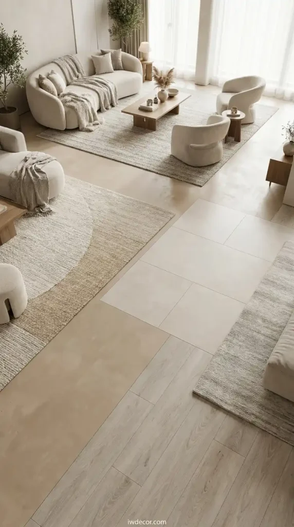
Light wood floors are traditional, but in 2026, scandinavian interior decor also uses pale concrete, light tile, or light-wash vinyl that mimics wood. Whatever the material, it should feel warm and be easy to maintain. Area rugs anchor seating zones without dividing the space visually.
13. Window Treatments That Let Light Through
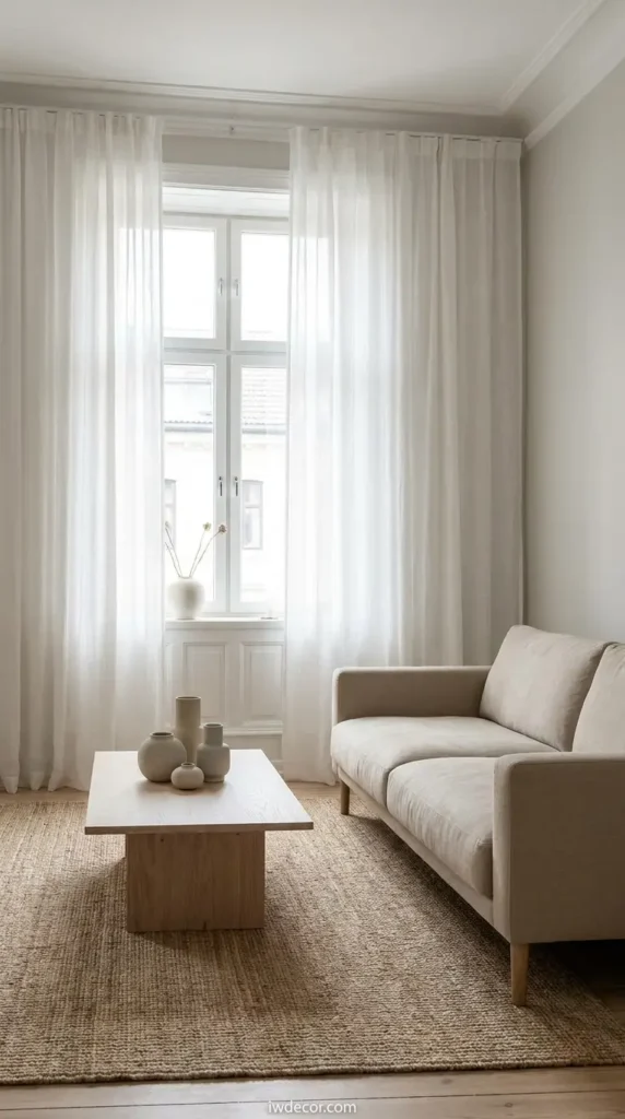
In scandinavian interior decor, windows are too valuable to block. Sheer linen or cotton curtains filter light without darkening a room. If you need privacy, roller shades in white or natural linen work behind sheers. Heavy drapes contradict the whole point.
14. Art Curation Over Wall Clutter
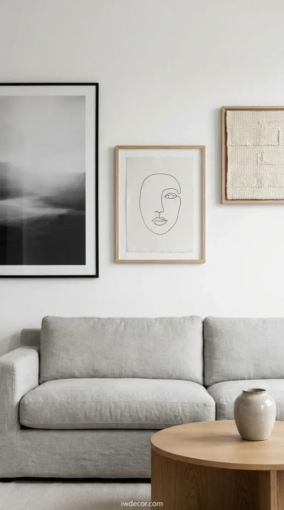
Three well-chosen pieces on a wall says more than eight. In scandinavian interior decor, art is usually minimal: a simple line drawing, a black-and-white photograph, or a textile. Frame it simply (black or natural wood) and let it breathe with white space around it.
15. Functional Beauty Over Decoration
The core rule of scandinavian interior decor is nothing exists just to look pretty. A blanket is on a chair because you use it or drape it thoughtfully. A wooden bowl sits on a shelf because you keep things in it. This constraint actually makes the aesthetic stronger every object has permission to exist.
If you’re just starting with this style, our guide to 15 Scandinavian bedroom ideas on a budget walks through creating one complete room. Or if you’re focused on a specific zone, check out the best Scandinavian kitchen cabinet colors for a clean look to nail one area before expanding elsewhere.
FAQ: Your Scandinavian Interior Decor Questions Answered
What is Scandinavian interior design style?
Scandinavian interior design originated in Denmark, Norway, Sweden, and Finland as a response to long, dark winters. It prioritizes light, function, and warmth through minimalist forms, natural materials, and a carefully edited color palette. The style blends practicality with coziness, rejecting excess while embracing comfort.
Is Scandinavian decor still popular in 2026?
Yes. While pure minimalism faded, Scandinavian interior decor evolved to include more warmth and texture. It’s moved from “minimal and cold” to “minimal and livable,” adding layers of comfort without sacrificing the core ethos. The style’s longevity comes from solving real problems: making small spaces feel bigger and dark months feel brighter.
How do Scandinavians actually decorate their homes?
With intention and patience. Scandinavian interior decor doesn’t happen overnight; rooms evolve over years. The process starts with a light, neutral base, then layers in natural materials, textiles, and thoughtfully chosen pieces. Every object should earn its place through either function or genuine value.
What colors are common in Scandinavian design?
Whites, soft greys, warm beiges, and natural wood tones form the base. Accent colors are muted: sage green, dusty blue, pale terracotta, and greige. Black appears in small doses for contrast. In 2026, warmer neutrals are gaining ground over cooler greys think clay and soft taupe instead of charcoal.
What makes a home look outdated in Scandinavian design?
Too much stuff. Visible clutter, overfilled shelves, too many patterns competing at once, and furniture that’s purely decorative all read as dated. Dark, heavy wood and stark minimalism (the 2015 version) also feel behind the curve now.
What is the best color for Scandinavian walls?
Warm off-whites and soft creams work best because they bounce light without feeling institutional. Pale greige (grey-beige) is also rising as a sophisticated alternative. Avoid pure white if your room gets limited natural light; it can feel cold rather than bright.
The Takeaway
Scandinavian interior decor isn’t a aesthetic you copy from Pinterest; it’s a logic you apply to your own space. The 3-5-7 rule, the 70/20/10 principle, and the emphasis on light all serve the same purpose: making a home feel bigger, brighter, and more intentional. Start with walls and wood, layer in textiles and lighting, and resist the urge to fill every surface. The rooms that feel most Scandinavian are usually the ones where you notice the emptiness as much as the objects.
Ready to start? Pick one room, apply these 15 principles, and watch how the space transforms. Scandinavian interior decor rewards patience, but the results are worth the wait.