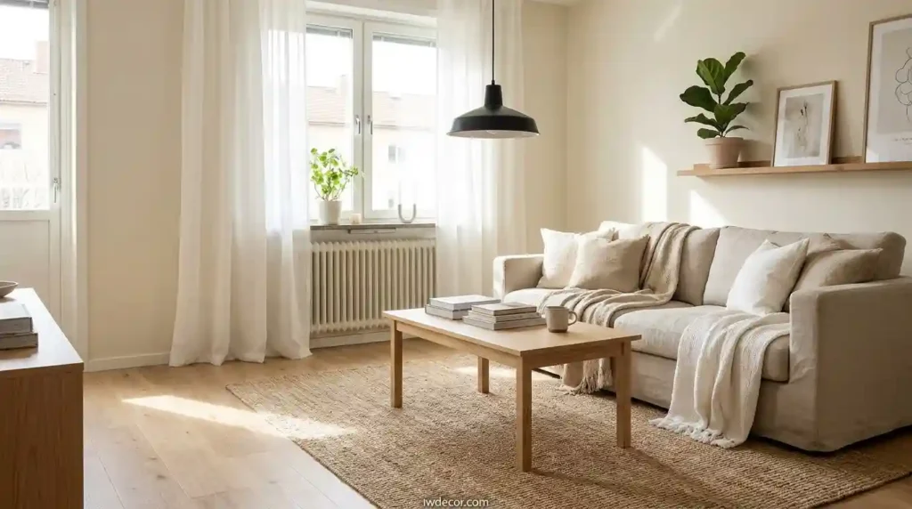
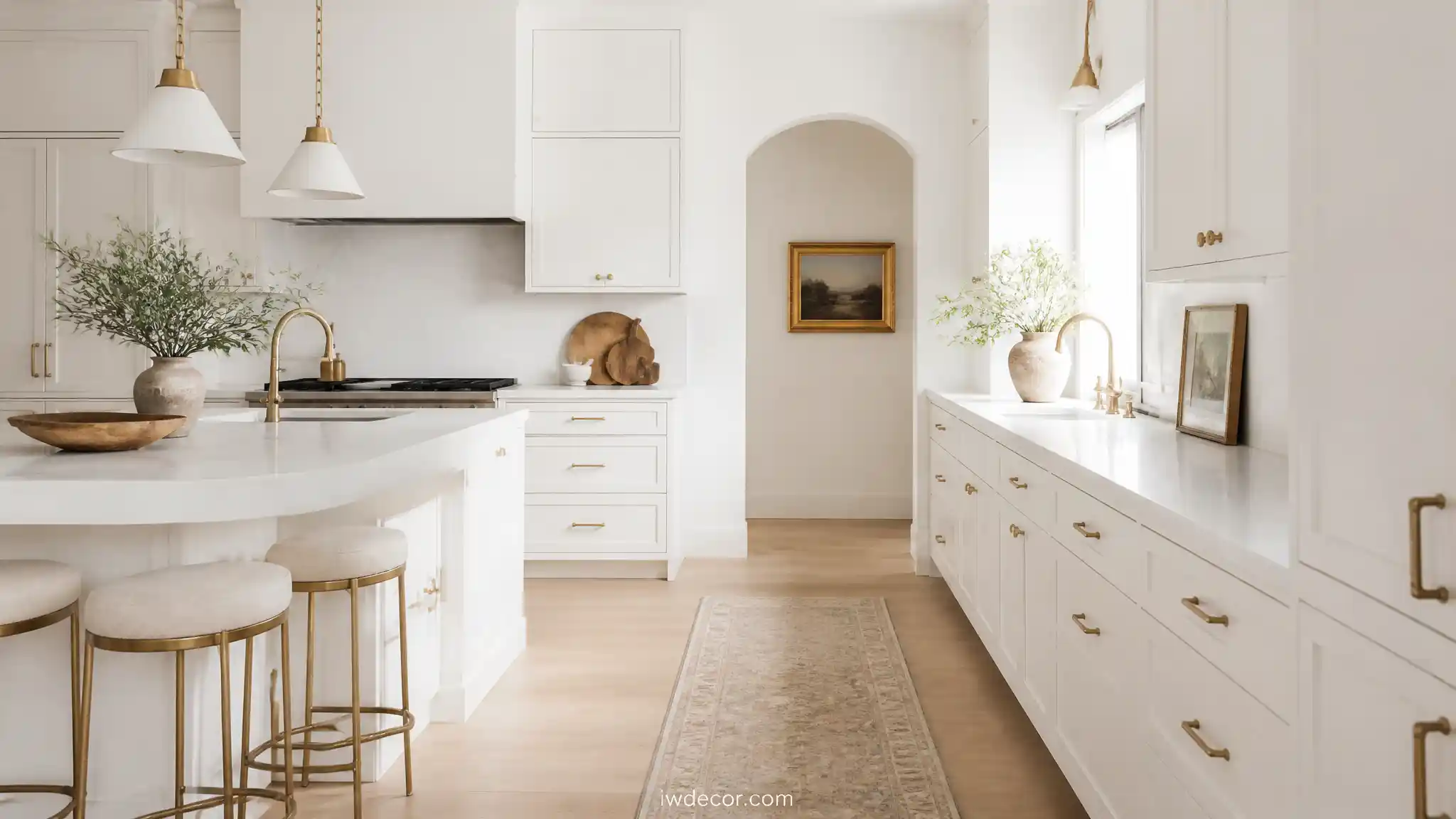
Best Scandinavian Kitchen Cabinet Colors for a Clean Look
The Best Scandinavian Kitchen Cabinet Colors for a Clean Look
Walk into a Scandinavian kitchen and the first thing you notice is what’s missing: clutter, shine, anything shouting for attention. The cabinet color is doing most of that work. Get it right and the room feels calm without feeling cold. Get it wrong and you end up with a kitchen that looks either sterile or like it’s trying too hard. Below are 14 scandinavian kitchen cabinet colors that actually hold up once the paint dries and the lighting changes, grouped by the role each one tends to play in a room.
The whites and neutrals that anchor everything
01OF 14Soft matte white
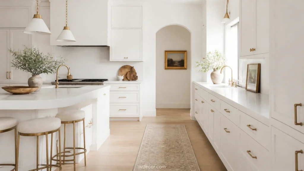
Instead of a stark, bright white that turns almost blue under artificial light, Scandinavian kitchens lean on a matte white with a faint warm undertone, closer to old paper than printer paper. It reads calm rather than clinical because the finish absorbs light instead of bouncing it back, and it pairs naturally with pale wood flooring or open shelving without fighting either one. Pro-tip: test the white in the room at night under your actual bulbs, since a shade that looks warm at noon can turn sterile under cool LED light.
02OF 14Warm off-white or cream
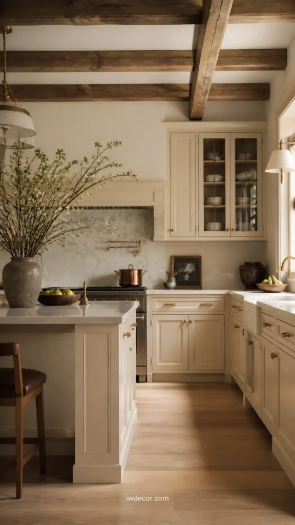
A step warmer than pure white, an off-white or cream does a lot of the same brightening work but feels less like a decision and more like the room already looked that way. It’s a forgiving choice for kitchens with a lot of wood or unlacquered brass, since it won’t compete with the wood’s warmth the way a cooler white can. Pro-tip: pull the wall color one shade cooler than the cabinets, or the whole room can start to feel yellow rather than warm.
03OF 14Dove grey
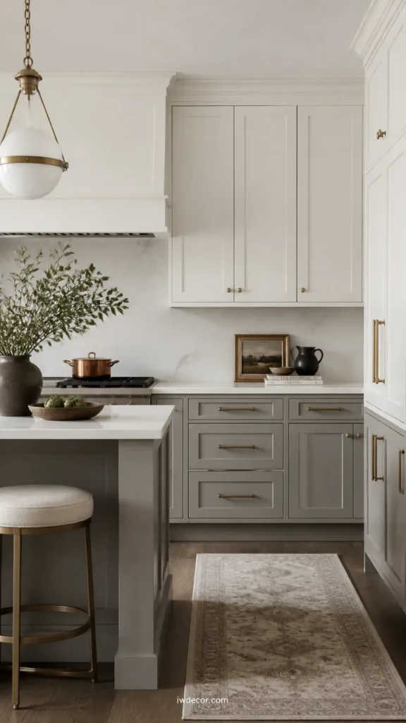
Dove grey sits right between white and grey, cool enough to feel calm but not so cool it turns the kitchen grim on an overcast day. It works especially well on lower cabinets paired with white uppers, since the lightness up top keeps the contrast from reading heavy. Pro-tip: stick to a matte or eggshell finish here, since satin or semi-gloss can look institutional fast in a color this quiet.
04OF 14Greige
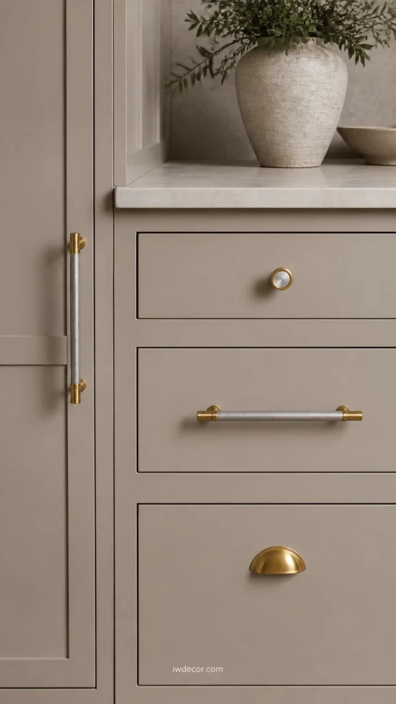
Greige, the grey-beige hybrid, is the color for someone who wants warmth without fully committing to a warm palette. It’s flattering in kitchens with mixed metal finishes, since it doesn’t pick a side between the coolness of chrome and the warmth of brass. Pro-tip: check the undertone against your existing countertop before you commit to a large run of cabinets, since a greige with a pink undertone can clash badly with a cool grey stone counter.
05OF 14Warm taupe
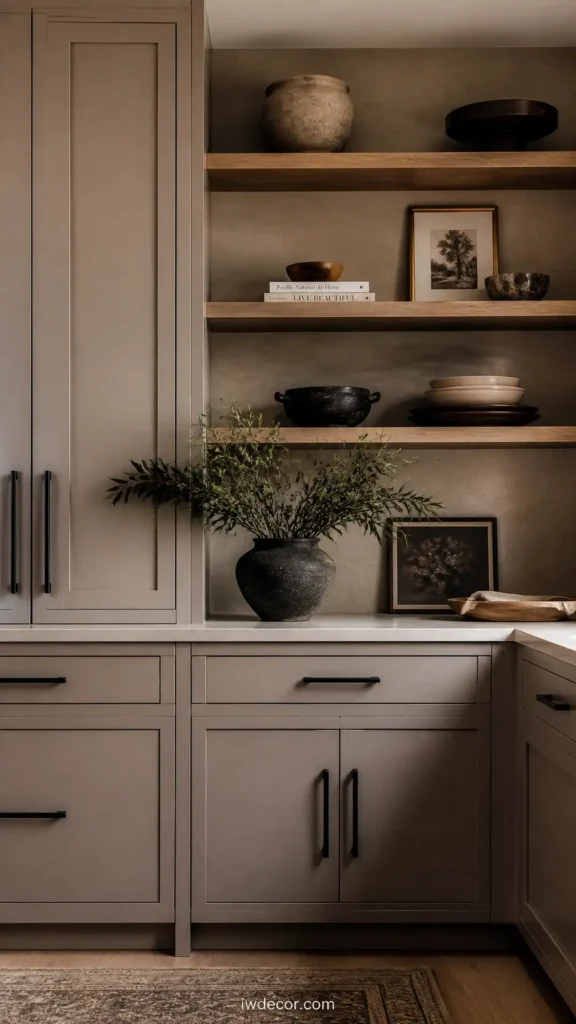
Taupe reads more brown than grey, and it’s a steady, unshowy choice for a kitchen that gets used hard and doesn’t need to make a design statement. It pairs well with black hardware and open wood shelving, since the taupe stays in the background and lets those details do the talking instead. Pro-tip: avoid pairing taupe with a taupe or beige wall color in the same tone; the room needs at least one lighter surface to keep it from flattening out.
The muted colors, used with restraint
06OF 14Sage green
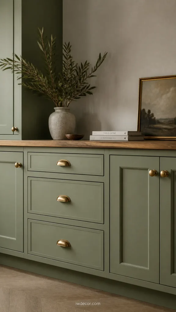
Sage is probably the single most recognizable Scandinavian kitchen color at this point, and it earns the reputation because it’s green without being loud about it. It reads calmest when paired with natural wood countertops and simple black or brass pulls, so it doesn’t slide into looking like a nursery. Pro-tip: sage shifts noticeably under different light temperatures, so bring a sample home and look at it evening and morning before committing to a full run of cabinets.
07OF 14Dusty blue-grey
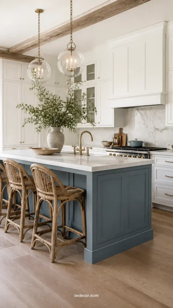
A blue with enough grey mixed in that it never tips nautical or nursery-adjacent, dusty blue-grey works well as a full cabinet color in a kitchen with plenty of window light, or as an island color against otherwise white cabinetry. It’s a good middle ground for someone who wants color but isn’t ready to commit to a full room of it. Pro-tip: pair it with warm open shelving so the blue has something to bounce off besides white walls.
08OF 14Deep forest green
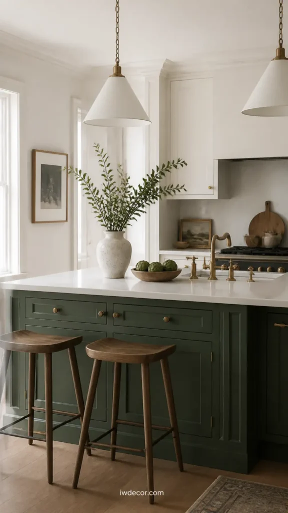
Where sage is soft, forest green is a real commitment, and it’s usually best kept to an island or a run of lower cabinets rather than the whole kitchen. It reads best in a room with generous natural light and simple, unfussy hardware, since the color is already doing the visual work. Pro-tip: keep the surrounding walls and ceiling light and neutral, so the dark cabinet run has room to be the one bold move instead of competing with a bold wall color.
09OF 14Muted terracotta or clay
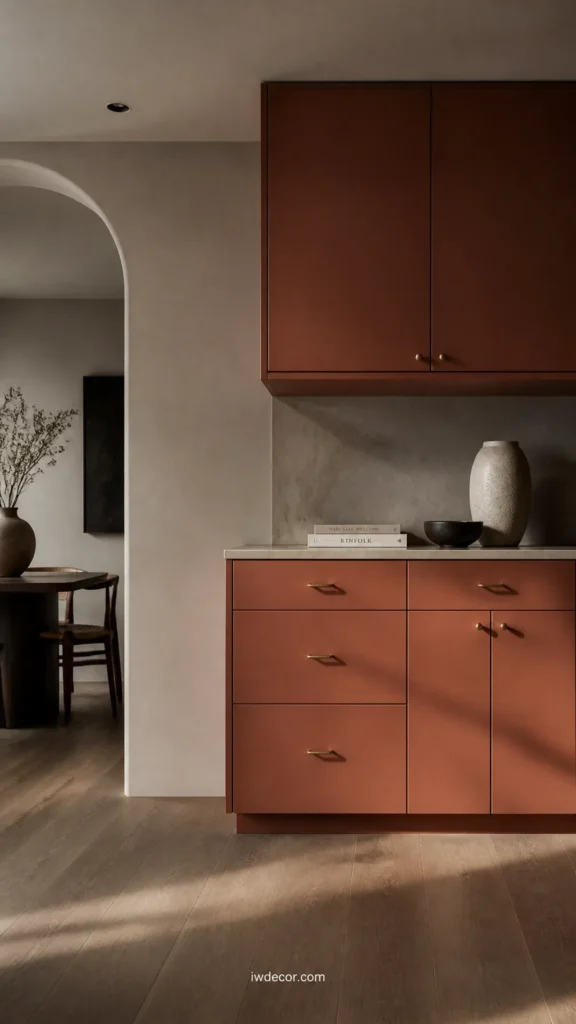
Less common than the greens and blues, a dusty clay or terracotta cabinet color brings warmth into a kitchen that might otherwise lean cool, especially useful in a north-facing room that never gets much direct sun. It sits well against pale grey walls and light wood flooring, since the earth tone keeps the palette from reading too Mediterranean. Pro-tip: use it on cabinetry only, not walls, so the room can still feel more Scandinavian than terracotta villa.
10OF 14Pale sand or beige
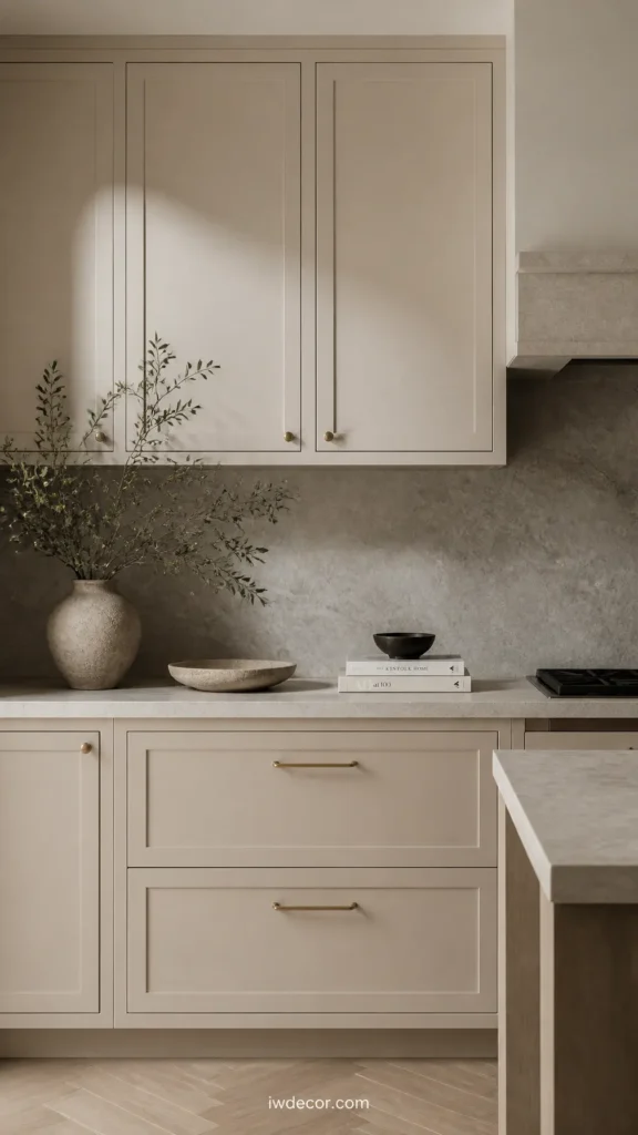
A pale sand color sits close to white but noticeably softer, good for someone who wants warmth but found stark white too cold and pure oak or pine cabinetry too yellow whenever it sits alone. It pairs with a slightly darker sand or backsplash tile so the whole run doesn’t read as a flat block of near-white. Pro-tip: pair a pale sand with at least one warmer wood tone in the room, or it can start to feel like an undecided white.
Contrast and two-tone combinations
11OF 14Charcoal or soft black
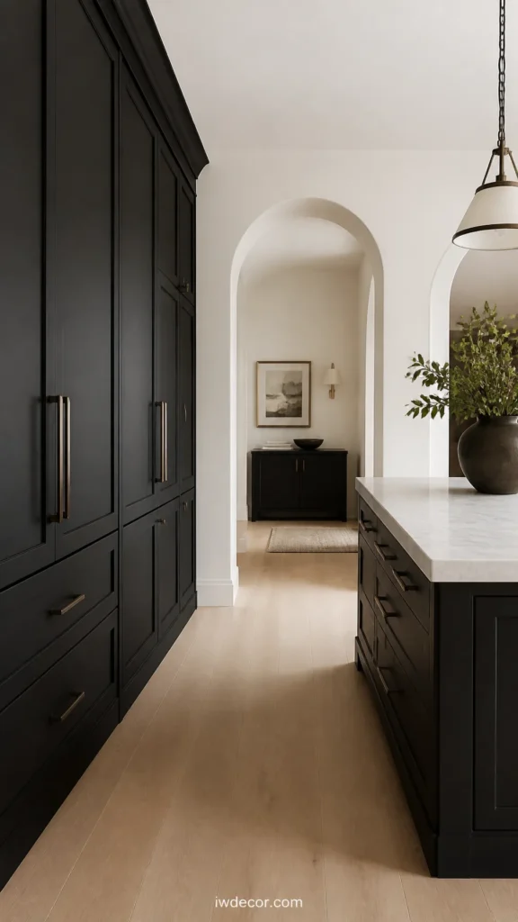
A full run of charcoal or soft black cabinets is a bigger swing, and it only really works in a kitchen with strong light, since dark cabinets absorb light rather than bounce it back. Paired with a light wood floor and plenty of white wall space, it can look sharp rather than heavy. Pro-tip: skip this one in a windowless or basement kitchen, where the same color that looks moody and intentional in a bright room can look plain dark in a dim one.
12OF 14Natural wood paired with white
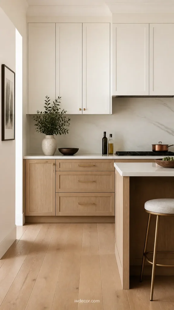
Rather than a single paint color, this pairs unpainted or lightly stained lower cabinets with painted white uppers, which is arguably the most classic Scandinavian combination there is because it pulls the room toward feeling grounded without any single surface doing too much visual work. Pro-tip: match the wood tone of the cabinets to the floor or at least keep them in the same warm or cool family, so the two don’t compete.
13OF 14Black and white, two-tone
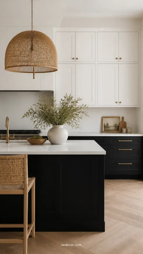
A sharper, more graphic version of the same idea, black lower cabinets under white uppers reads more modern than the wood-and-white pairing and works well in a smaller kitchen where a full run of dark cabinets would feel heavy. Pro-tip: bring in a warm material somewhere, a wood cutting board left out, a rattan pendant light, so the black and white doesn’t read as cold or purely graphic.
14OF 14Deep navy
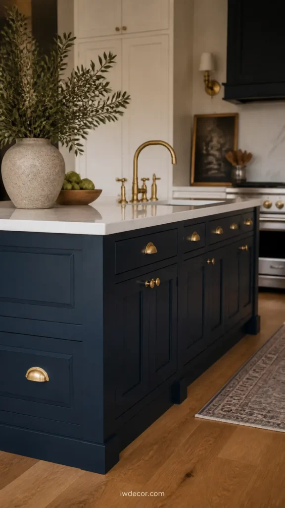
Navy is the cooler cousin of charcoal, still dark and still dramatic, but with a blue undertone that reads a little softer in a room with warm wood floors and brass fixtures. It’s most often used on an island rather than a full cabinet run, since navy across all cabinetry can feel heavy without a lot of natural light to balance it. Pro-tip: pair navy with brass or unlacquered hardware rather than chrome, since the warmth keeps the blue from feeling cold.
Which color actually fits your kitchen
| Color | Best for | Trade-off |
|---|---|---|
| Soft white | Small or dark kitchens that need to feel bigger | Can read sterile without wood or texture to warm it up |
| Sage green | A kitchen that wants personality without chasing a trend | Shifts a lot under different light, test before committing |
| Charcoal or black | Kitchens with strong, consistent natural light | Absorbs light, a poor fit for a dim or windowless room |
| Warm taupe or greige | Anyone who wants warmth without picking a bold color | Can look flat next to true white trim or countertops |
Wrapping up
None of these colors are Scandinavian because of the paint itself; they’re Scandinavian because of the restraint around them; light floors, simple hardware, and one dominant tone instead of five competing ones. Pick a sample, live with it for a few days under your actual lighting, and go from there.
FAQ
Do Scandinavian kitchens always use white cabinets?
No. White is the most common starting point because it works with limited daylight, but sage green, muted blues, taupe, and even black or navy show up often, usually on an island or in a two-toned pairing rather than across every surface.
What cabinet hardware works best with these palettes?
Brass or unlacquered brass is the most common pairing because it warms up cool palettes like grey and white, while matte black hardware sits well against lighter greens, taupe, or greige for a slightly more graphic look.
Is sage green already out of style?
It’s been popular long enough that some people are moving away from it, but a muted, greyed-down sage tends to age better than a brighter, saturated green, since it was never chasing a trend cycle the way a brighter green was.
What’s the easiest way to test a color before painting cabinets?
Buy a sample and paint it onto a piece of cardboard or actual cabinet door, then move it around the kitchen and check it at different times of day. A color that looks right on a chip under store lighting can look completely different next to your actual floor and countertop.