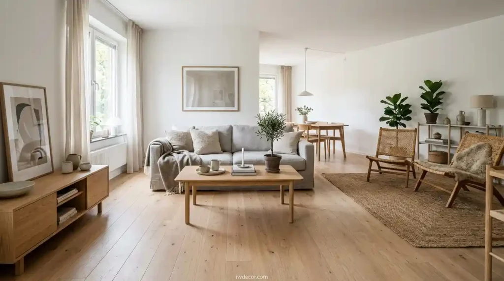
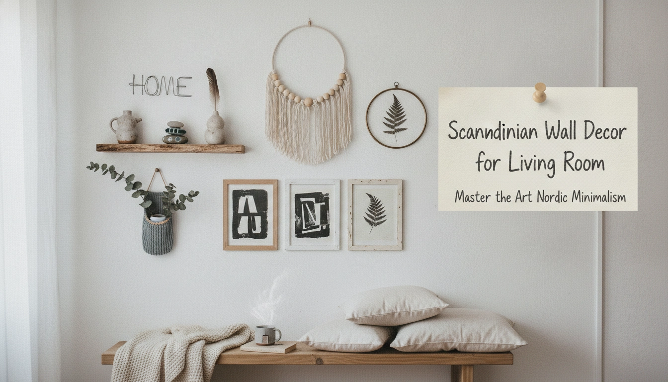
Scandinavian Wall Decor for Living Room: Master the Art of Nordic Minimalism
Honestly looking at a blank wall makes me feel physically cold. Like staring into a vacuum. But then people panic and buy things just to fill it up and that is always a disaster. You do not need to cover every single inch of drywall. I was just talking about this with Marian Cooper down in Brisbane on Eason Rd and her lounge had this massive wall that felt like a freezing concrete block. Miserable. We did one giant, gorgeous light oak frame with a simple line drawing and suddenly the whole room breathed. Just one thing. It works.
Quick Access
In this guide, you will discover the core principles of Nordic design, key color palettes, and practical ways to arrange your wall art to achieve a balanced, clutter-free home.
What Makes Wall Decor Scandinavian Style?
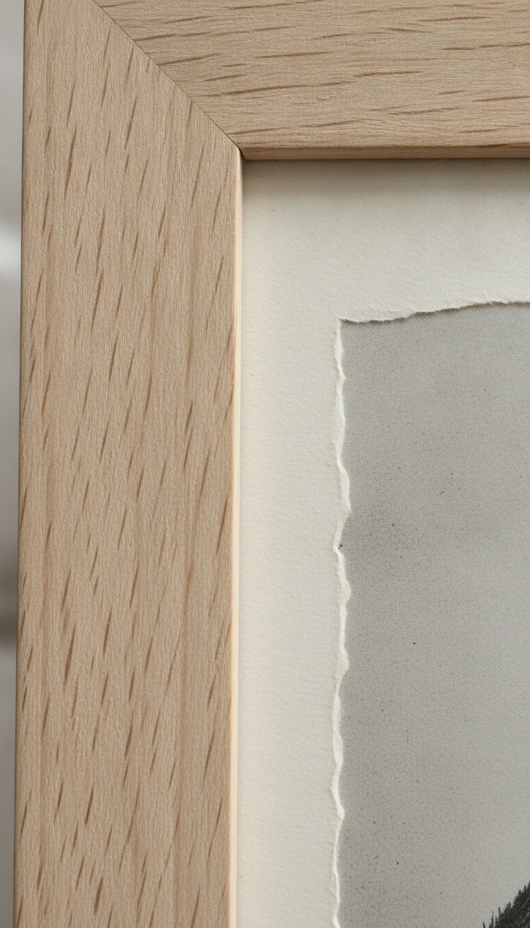
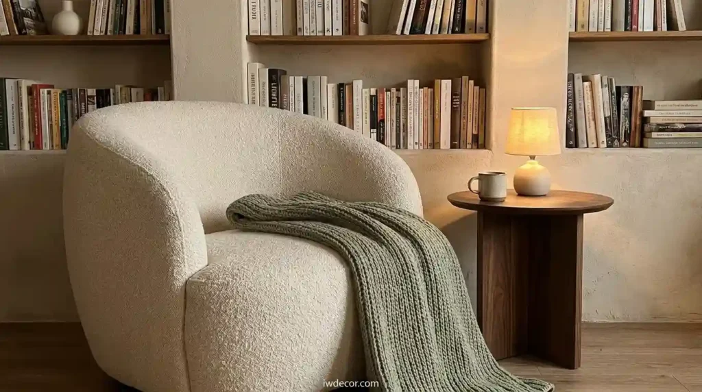
People think Scandinavian style is just white paint and cheap flat-pack tables. It isn’t. It is about warmth. Clean lines. Mostly, it is about how a texture makes you feel when the afternoon sun hits it. You want things that feel honest. Raw wood grain. Heavy matte paper that doesn’t bounce glare into your eyes. It is that hygge thing everyone was obsessed with. But simplified. Less fuss. We want tactile pieces. A heavy woven wool hanging. Or a frame that smells like ash wood.
Honestly, I look at these design terms and my head spins, so I put together a quick little guide to show you exactly what we want and what we absolutely need to leave behind.
My Take
Texture is your secret weapon here. If you touch a piece and it feels cold or plastic, do not hang it on your wall. Keep it real, keep it simple, and let the materials do the talking.
Key Principles of Scandinavian Wall Decor
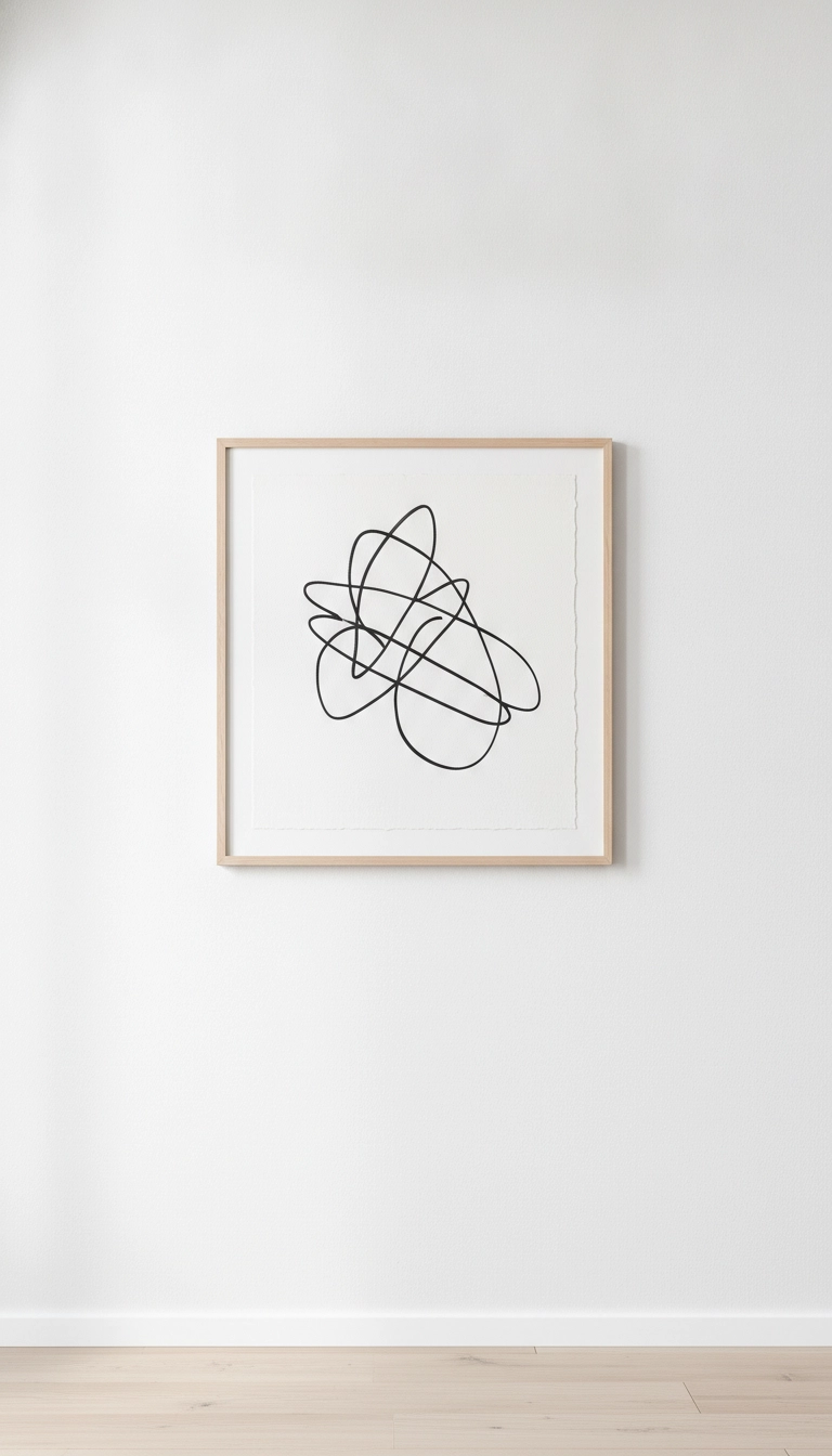
My biggest rule is pretty simple. If it does not have a job or a beautiful shape, it goes. Find that sweet spot between texture and function. Buy things that last. Timeless, distinctive pieces. Think about scale. Everyone makes the mistake of buying tiny frames because they are cheap. Then they hang them in a weird little cluster that looks like a swarm of bees. Don’t do that. Go big. One massive, beautiful piece of art will do more for your sanity than a dozen cheap little frames. Leave empty space.
The Sixty-Forty Rule
Aim to leave at least forty percent of your wall space completely empty. This negative space acts as a frame, making your chosen decor pieces look intentional and curated rather than cluttered.
Best Color Schemes for Scandinavian Wall Decor for Living Room
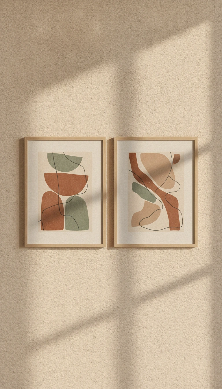
Color is where people get really nervous. They go totally sterile or buy something incredibly bright that they hate in three weeks. Start with your base. Warm whites. Not cold, blue-toned hospital whites. Think oatmeal. Or a very soft, sleepy gray. This is your canvas. It catches the natural light. When you start adding art, keep the palette quiet. Earthy. Muted terracotta. Or a dusty, faded sage green. Maybe some deep charcoal lines to anchor things. Use minimalist prints on matte paper. Shiny prints look incredibly cheap under living room lights.
I know how hard it can be to visualize how these colors actually come together, so I made this simple breakdown of the perfect Nordic palette for your walls.
My Take
Never buy your paint or art under harsh store lighting. Bring samples home and see how they look at four in the afternoon when the sun starts to dip. That is when the real magic happens.
Scandinavian Wall Shelves and Textured Decor
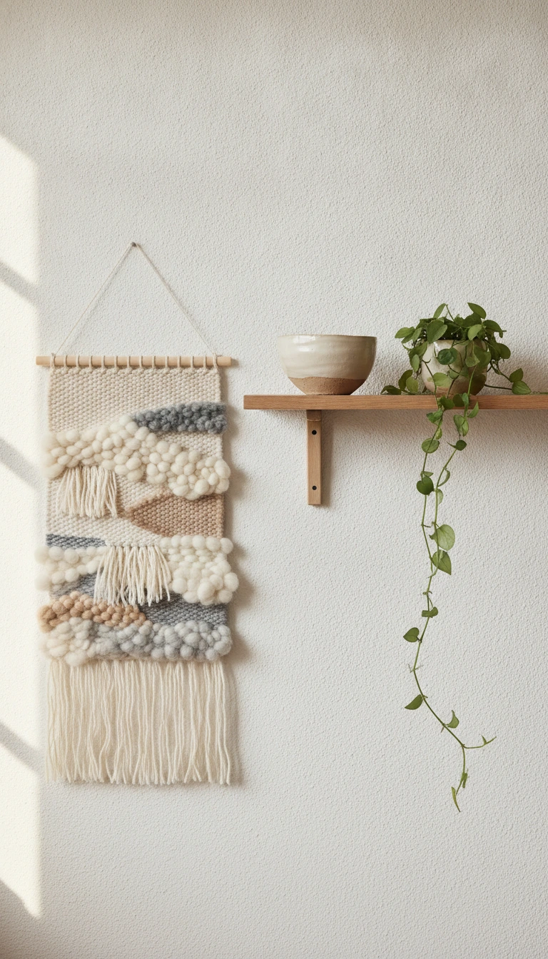
Shelves are great because they get things off the floor. But they get messy fast. If you use floating shelves—birch or pale oak are really the only options here—you have to edit them constantly. Put a single, beautiful ceramic bowl on one. Maybe a small, trailing green plant. Not fifty books. Texture is your best friend when a room feels too flat. If you have hard plaster walls, hang something soft. A simple woven tapestry. Natural, undyed fibers. Jute. Wool. Cotton. It brings the outside world in.
Now, let us talk about the budget because we all have one, and knowing where to spend your money makes all the difference. Here is a little breakdown of what you can expect to spend on these different wall elements.
My Take
Do not let the prices scare you. A single gorgeous mirror is worth three cheap frames. Invest in one stunning piece that anchors the room rather than buying clutter.
Statement Mirrors and Wood Accents
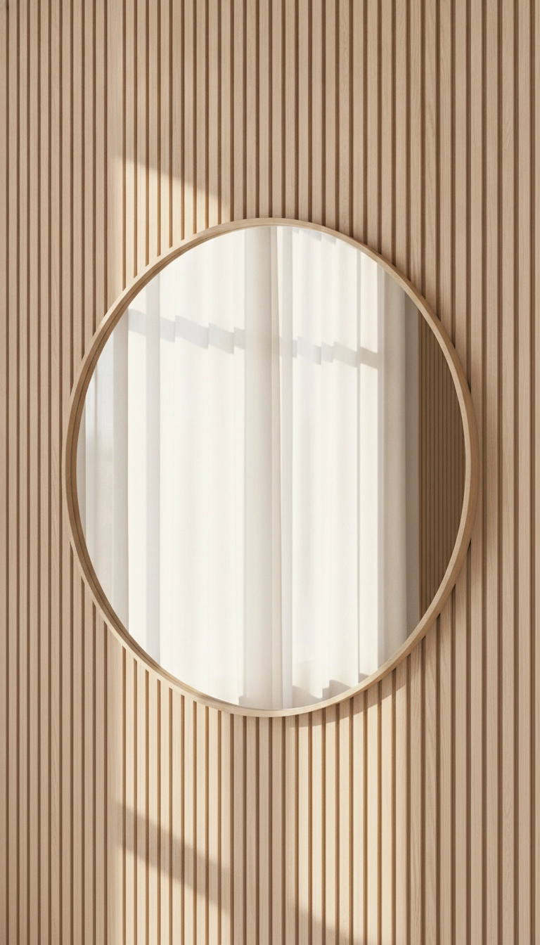
If your room feels dark, buy a mirror. Seriously. Don’t just hang another picture. A huge, round mirror with a whisper-thin wooden frame is like adding another window. Hang it directly opposite your main window. It catches the daylight and throws it right back into the dark corners. Wood accents are another trick. Lately, I have been loving those vertical oak slats. You can do a small section of a wall with them. It adds this incredible architectural texture. You don’t even need to hang art on top.
Avoid Heavy Frames
Steer clear of ornate, heavy gold or dark wooden frames. They weigh down the wall visually and disrupt the light, airy feel essential to Scandinavian design.
How to Arrange Your Nordic Wall Art
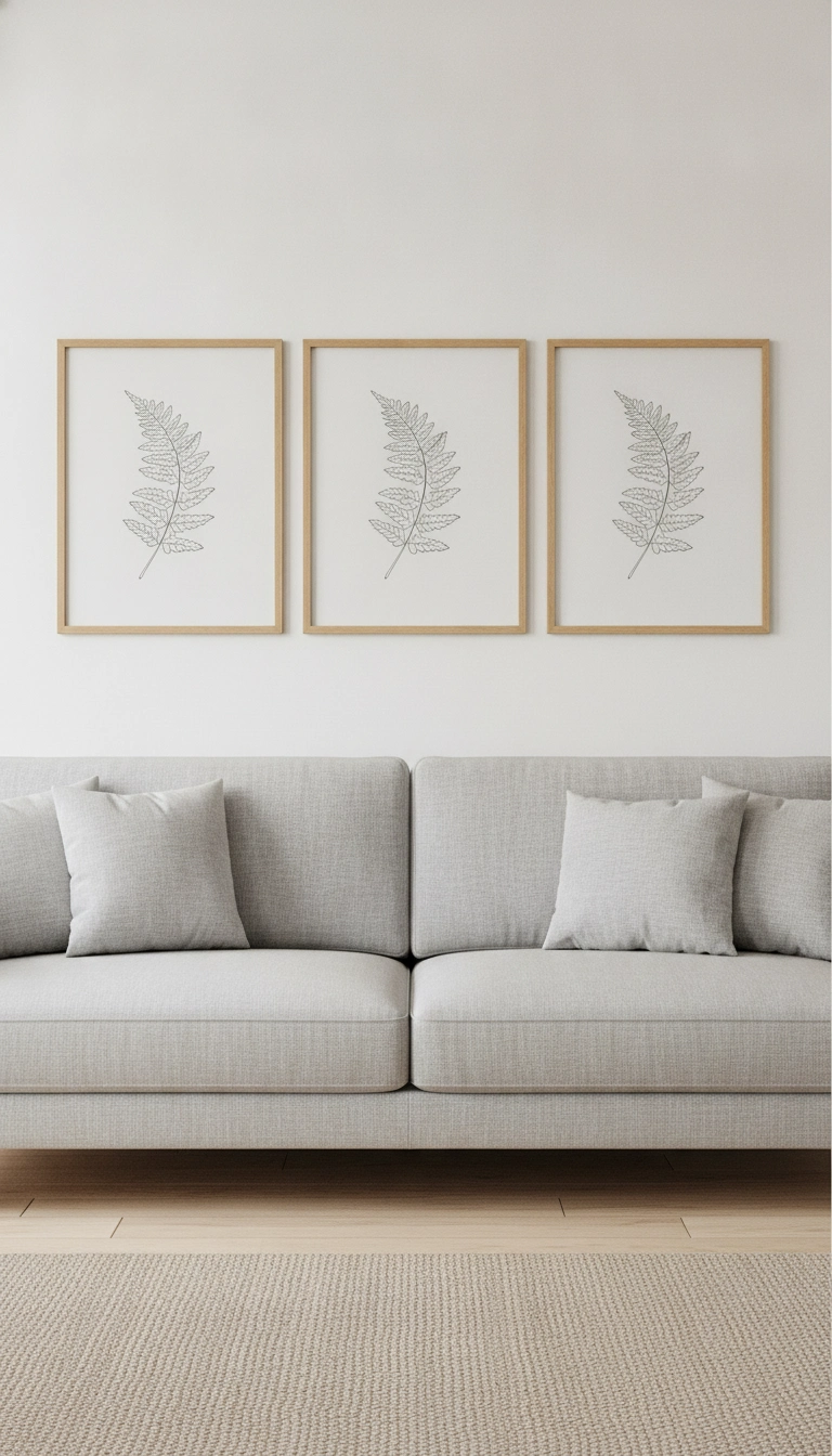
When hanging this stuff, please don’t wing it. Measure twice. If you want a gallery wall, keep it small. Three frames. Maybe four. Any more than that and it starts looking like a chaotic antique shop. Align them on a straight grid. Or try a triptych. Three identical frames side by side. It creates this immediate, beautiful sense of calm. It works perfectly if you hang them right above a long, low sofa. It feels grounded. Sophisticated.
Hanging art is where people usually start guessing, so I mapped out the three easiest ways to arrange your pieces without losing your mind.
My Take
When in doubt, go with the triptych. There is something so incredibly peaceful about three identical frames lined up perfectly. It just works every single time.
Conclusion: Embracing Simplicity in Design
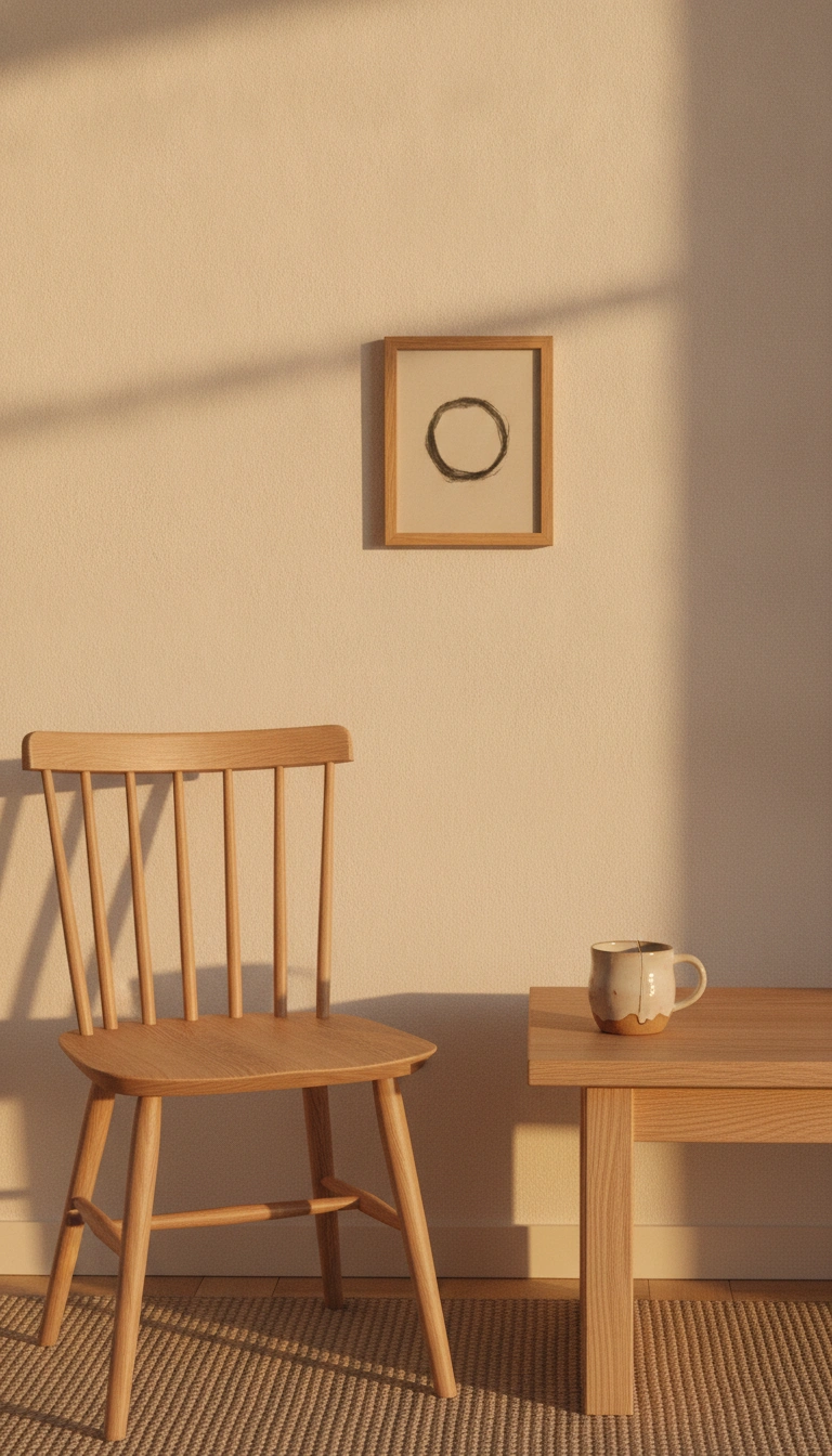
At the end of the day, a good home is about editing. It is about what you choose to leave out. Focus on high-quality materials. Real wood. Heavy paper. Natural wool. Keep the colors quiet and let the space breathe. What about you? What are you hanging on your walls to make them feel warm? Drop your ideas below. I’d love to hear them.