
Scandinavian Beige and Grey Color Scheme: The Art of Balanced Light
Look, natural light is brutal. It hits your wall at 10 AM and either your room breathes or it dies right there. I was texting Mae Duncan over on Lone Wolf Trail in Elizabeth the other morning because her white walls were totally blinding her, zero depth, just pure glare. You don’t need more stuff in the room to fix that. You need a scandinavian beige and grey color scheme that actually respects how light moves across space.
Understanding the Basics of the Scandinavian Beige and Grey Color Scheme
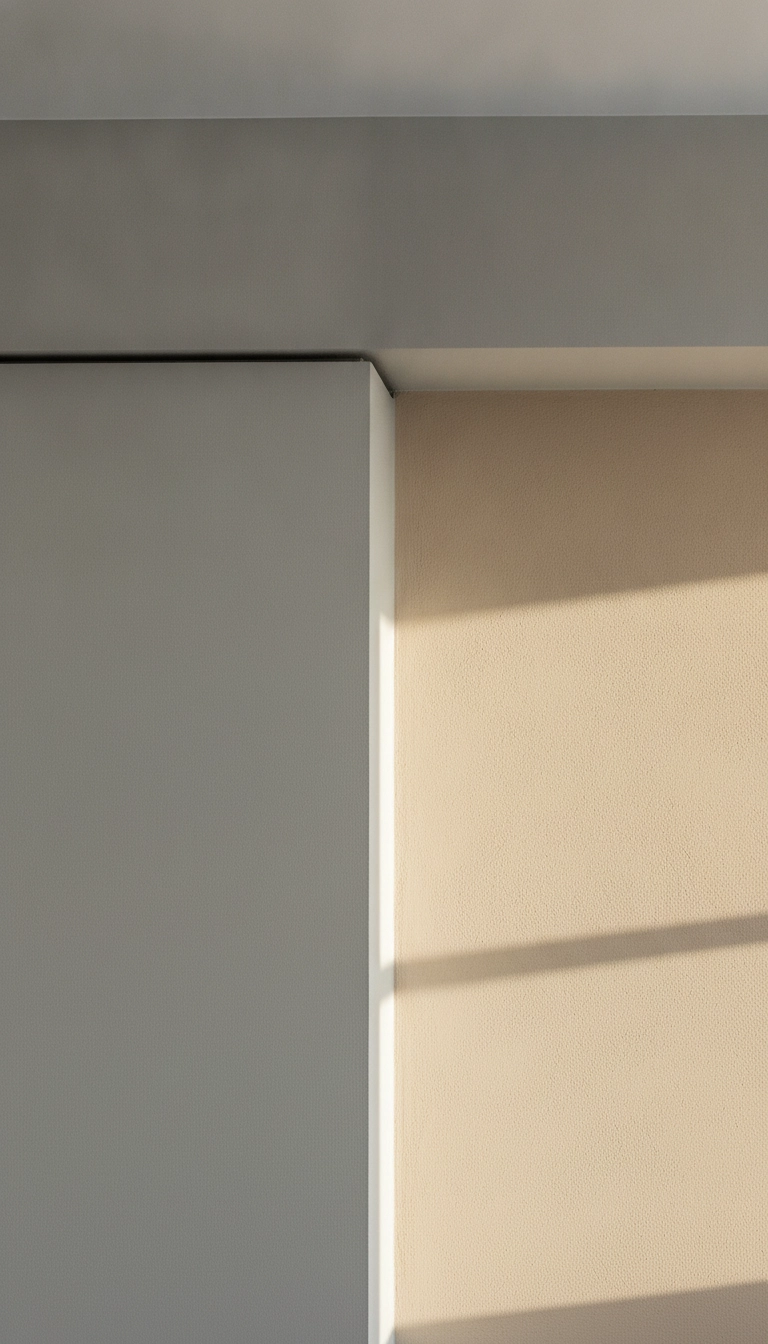
A Scandinavian beige and grey color scheme is basically a balancing act between warm yellow or pinkish undertones and cold slate or dove tones. It works. You create a dynamic reflection plane that softens direct sun while keeping your structural lines crisp.
When I looked at Mae Duncan’s setup in Elizabeth, her morning light was completely flattening the room. Shifting her walls to a low-chroma greige and putting warm sand tones on the adjacent surfaces immediately opened the space up. It’s a simple architectural trick. Color temperature contrast mimics how light shifts across northern landscapes.
The Greige Balance
When combining warmth and cool undertones, maintain a 60-30-10 distribution. Allocate 60 percent to warm beige bases, 30 percent to structural greys, and 10 percent to deep charcoal focal accents.
Why Beige and Grey Work Together in Scandinavian Interior Design
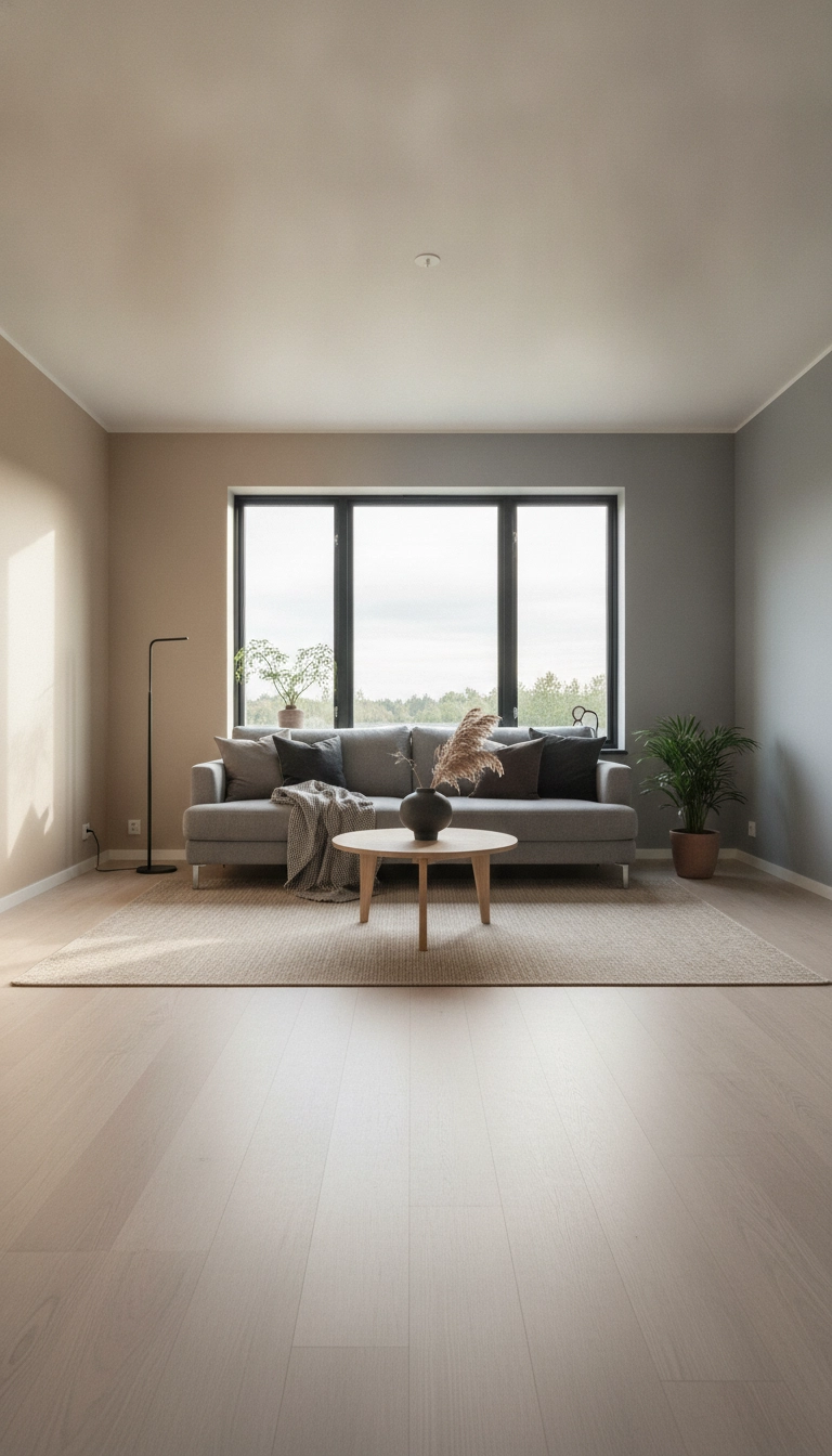
Up north, light is completely unpredictable. Low winter sun. Endless summer days. A single-tone room collapses fast under those conditions. It looks dark and sad in December, then totally blinding by July. Combining warm beige with cool grey creates an adaptable atmosphere.
Beige catches cool winter light and warms it up. Grey tames harsh afternoon rays. Together, they hold the room in balance. Your eyes stop worrying about glare and focus on the spatial flow instead.
Shades of Beige for Scandinavian Spaces: Warm to Cool Undertones
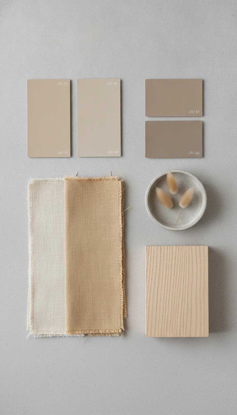
Pick your beige based on window orientation. North windows give you cold, flat light. You need honey, oat, or wheat undertones to keep the place from feeling like a basement. South windows get flooded with yellow rays, so cooler taupes and mushroom shades work much better to absorb that excess heat.
Oatmeal beige is brilliant on main wall surfaces. Soft texture. Easy on the eyes. Mushroom beige makes sense for lower built-in cabinets because it grounds your vision without making the furniture look heavy.
Light Reflectance Value matters a lot here. Oatmeal beige sits around seventy-two percent LRV, reflecting plenty of light back into the room. Dove grey hits roughly sixty-four percent for gentle contrast. Mushroom taupe sits near forty-eight percent to anchor mid-tones, while deep charcoal sits down at fifteen percent to lock down focal points.
I like to map out these paint selections based on window exposure before touching a single brush, so here is a direct breakdown of how light orientation dictates your tone choices.
My Take
Matching your undertone directly to window orientation prevents neutrals from turning dreary or washed out as daylight shifts throughout the day.
To visualize how these specific finishes reflect natural daylight back into your space, here is a direct comparison of their light reflectance values.
My Take
Always keep high reflectance values on primary wall planes to maximize natural daylight bounce into the deepest zones of the room.
Grey Variations in Scandinavian Design: From Soft Dove to Charcoal
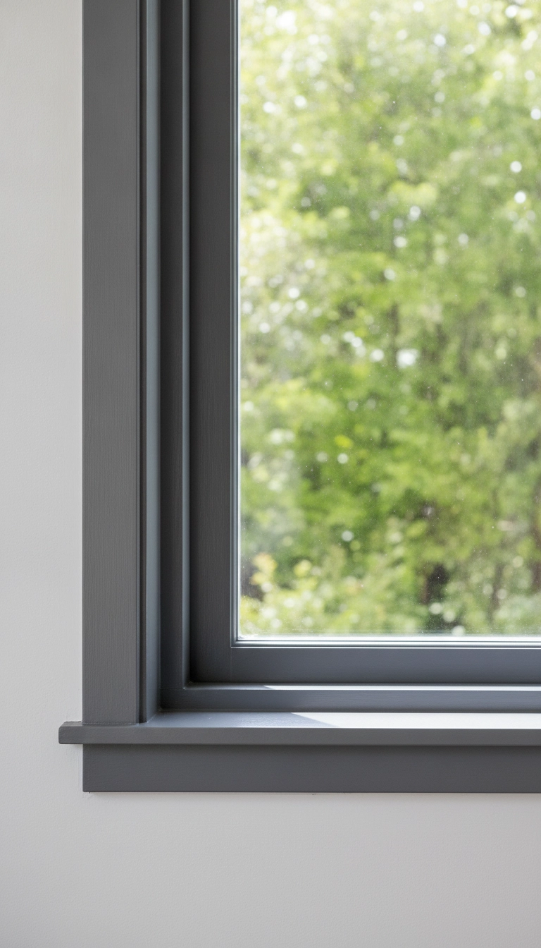
Grey gives structure to an open space. Put soft dove grey on your door frames and baseboards. It marks the transitions without chopping up the sightlines. Medium ash grey works best on larger seating pieces, keeping loose furniture configurations grounded.
Use charcoal or slate sparingly. Dark paint on a window sash or low shelf acts like a picture frame, drawing your eye right out toward the garden trees and creating instant spatial depth.
Here is how I structure grey variations across an interior layout to define architectural boundaries without blocking sightlines.
My Take
Applying darker charcoal tones specifically to thin structural lines like sashes creates an immediate illusion of greater room depth.
Beige and Grey Living Rooms: Scandinavian Design Ideas
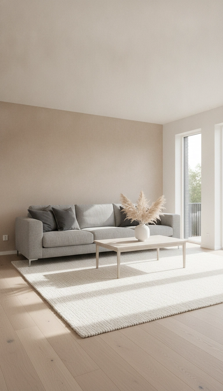
Living room color balance dictates how restfully a space reads. Try a muted sand finish on the primary walls. Keep the ceiling a clean, untinted white to bounce ceiling light downward into your seating layout. Put a simple ash grey sofa right against that warm backdrop.
Layering tonal contrast keeps flat surfaces alive. A pale beige wool rug over light oak floors cushions noise and softens the floor plane completely.
Proximity Rule
Keep cool grey elements closer to natural light sources like window frames, and place warm beige elements deeper inside the room to pull light into shadowed zones.
Textiles and Textures: Adding Warmth to Neutral Decor
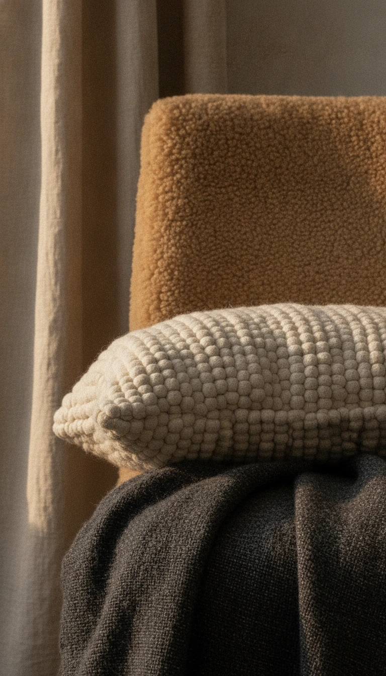
Without texture, neutrals fall totally flat. Scandinavian design relies entirely on tactile shifts to generate warmth. Mix chunky bouclé cushions with raw linen drapes and matte ceramic pots.
Rough grey plaster right next to soft tan shearling creates immediate tension between hard architectural elements and soft living surfaces. Stick to honest materials like unbleached cotton, brushed stone, and pale birch to keep everything connected to nature.
When working with a subdued palette, pairing the right tactile surfaces is critical to creating functional depth and warmth across the entire space.
My Take
Pairing hard architectural plaster against soft organic fleece builds tactile tension that keeps neutral spaces feeling vibrant and cozy.
Paint Colors: Best Beige and Grey Selections for Scandinavian Rooms
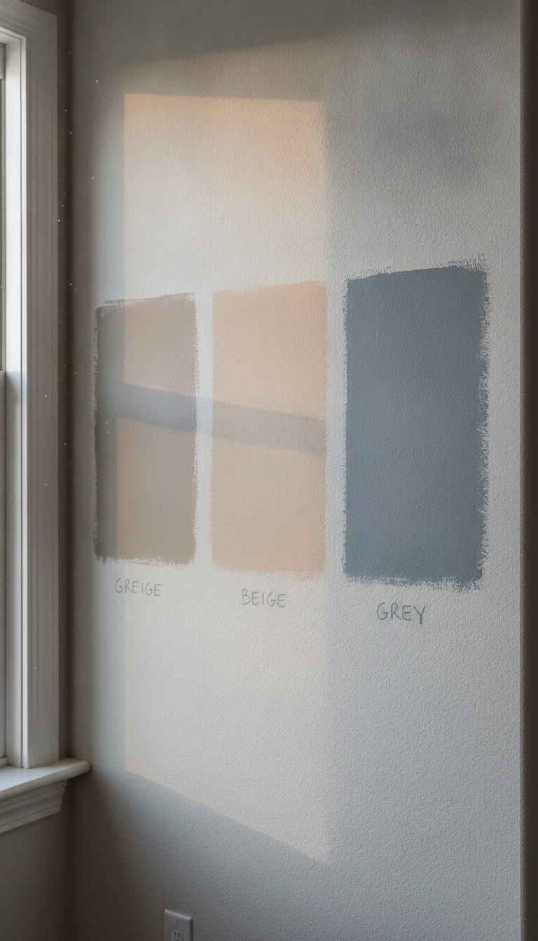
Test every paint sample in real sunlight over twenty-four full hours. You want subtle undertones that shift gently, not paints that turn sickly green or muddy purple when the sun drops.
Benjamin Moore Edgecomb Gray is a fantastic transitional color that sits right on the edge of beige and grey. If you want richer depth, try Farrow and Ball Skimming Stone alongside Cornforth White for a quiet, serene Scandinavian feel regardless of rainy weather outside.
To help you select proven paint formulations, here is how these key Scandinavian neutrals compare in application and visual tone.
My Take
Test these formulas on large swatches across multiple walls so you can watch how their undertones adapt from morning light through sunset.
Creating the Perfect Scandinavian Palette in Your Home
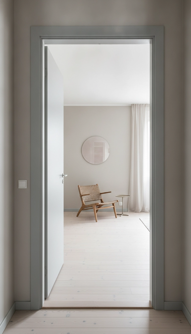
Start by looking closely at your room’s architectural structural points and natural windows. Put your foundational neutral paint on the main wall planes before you even start thinking about grey sofas or warm wool rugs.
Keep undertones consistent across every layer to build a quiet space that feels open yet cozy. Combine flat matte wall paint with satin trim and textured fabrics to enrich the sensory experience without cluttering the room.
Conclusion
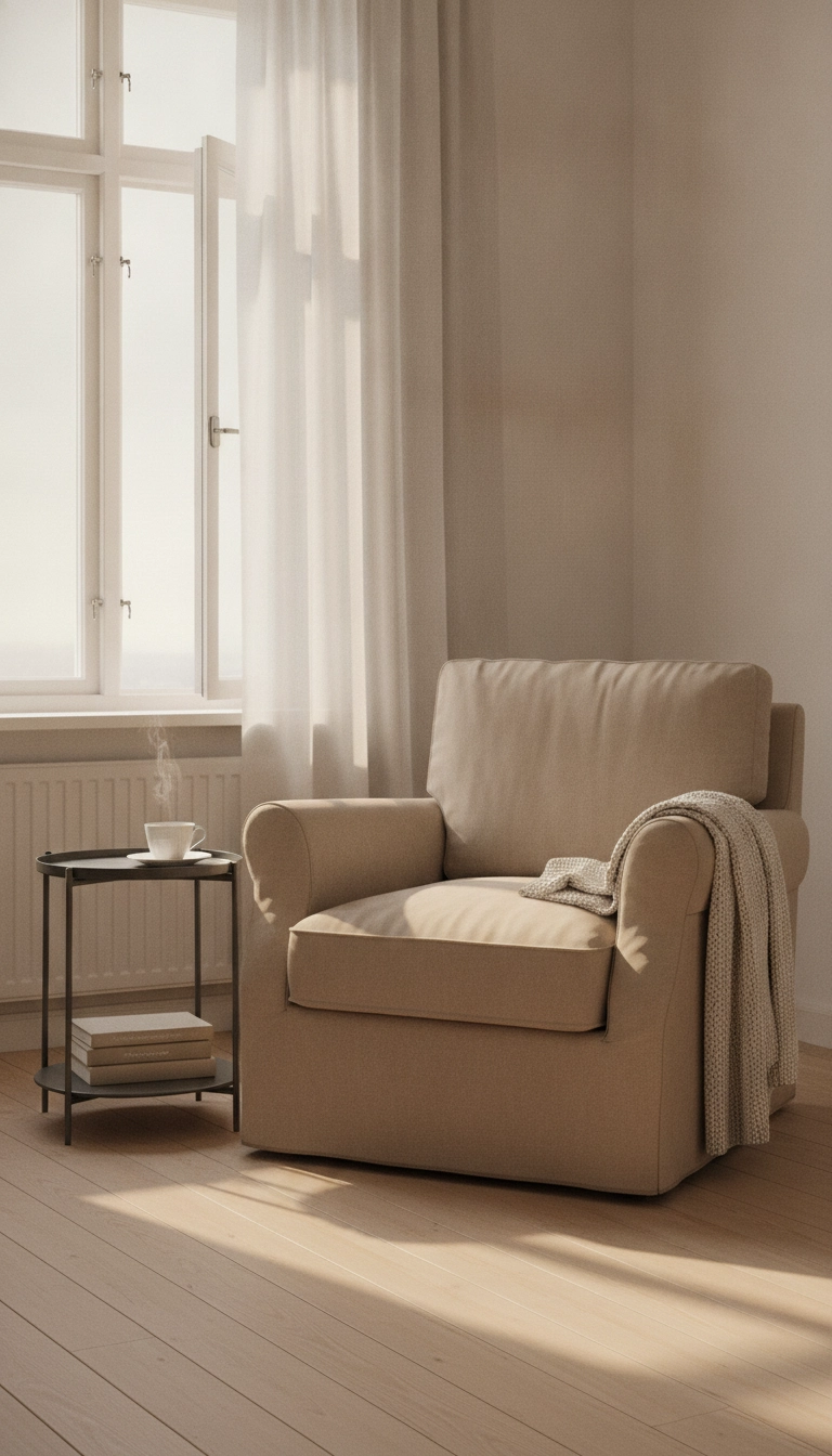
Designing a bright, quiet home is really just about managing how natural light hits form and shadow. Applying a scandinavian beige and grey color scheme transforms standard rooms into expansive, tranquil environments that support daily living. Work with contrast, trust simple materials, and let daylight dictate the layout. How are you balancing warm and cool neutrals in your space? Share your thoughts below.